Tag Archives: Reviews

Facebook Toolbar: First Glance

I was greeted with an invitation to install the new Facebook Toolbar (Firefox only). I must say, this is exactly what I needed. I wrote earlier about how to eliminate distractions and this is, ironically, a great way to do it. You don’t spend countless times during the day logging in to see if there is something new worth looking at (which means less time mindlessly browsing). In theory, that is…

Continue reading

me.dium

David Cohen from ColoradoStartups.com pointed to a neat tool today. It’s called me.dium and it’s a browser tool that tracks your surfing behavior and helps you determine relevant sites near you. While browsing you have the option of viewing your me.dium map. This map shows sites “near” you in terms of relevancy. The relevancy is determined by a number of things based on users’ surfing patterns (and a slew of other things, I’m sure). For example, the Wall Street Journal yields the map shown here.

As you can see, sites like USAToday, the NY Times and Washington Post show up as sites near your current page. If other users happened to be browsing these sites (or the one you’re on) you can actually communicate with them and add them as a ‘friend’.

I like this tool so far because it helps me draw connections that I (and others) might not otherwise make. Sites like StumbleUpon and digg are great but they require a human to make a conscious decision. I’d need to find something interesting or something relevant and go through some sort of process to flag that page. In me.diums case, it does all this for you.

Currently, me.dium is in private beta and constantly looking for feedback and improvements. I’ve only been surfing for a few hours but it’s a very interesting concept.. If you’d like to try it out (the more users, the better a tool like this works) then leave a comment telling me who you are, where you’re from, and how you first found my site. If you’re a CU student then you can just signup with your @colorado.edu address (me.dium is local to Boulder, CO).

The Starfish and the Spider

So far I’m doing a horrible job of maintaining my ‘read a book each month’ resolution. So, in my attempt to catch up I recently started acquiring a bunch of books. The first being The Starfish and the Spider: The Unstoppable Power of Leaderless Organizations by Ori Brafman and Rod Beckstrom (Amazon).

As others have mentioned, this book is kinda like a new ‘The Tipping Point’ in the sense that it looks at these societal phenomena and tries to simplify them. The book does that with two very clever metaphors: the starfish and the spider. A starfish is a creature that is decentralized. Cut off a leg and it grows back (and the leg becomes a new organism). If you cut off the head of a spider, though, it dies.

Some of the most successful groups have been decentralized. Alcoholics Anonymous, Wikipedia, even eBay has an element of decentralization to it. The point is, there are a lot of groups that require a certain level of decentralization; they need to find the sweet spot.

I enjoyed this book because it looked at a lot of cool subjects (from abolitionism to craigslist) and analyzed this underlying reason for their widespread success. I enjoyed it so much I took it to the gym for two days and finished the 200 pages in record time. I highly recommend this book to anyone and everyone because it takes very detailed observations and makes them easy to understand. 10/10

Note: I decided that I want to track my book reviews so I took the movie rating plugin found on the bottom site and created a a book review plugin. You can find it on my Tools page.

Pirates Sucked

Not to say the movie wasn’t entertaining, but, ehh, there were parts that made me cringe. Hard to say because I respect Mr. Bruckheimer so very much. I knew if I went to this movie tonight I’d regret it. Though, if you’re a fan it’s certainly one of those you’ll need to see in the theatre. Personally, I hate movie theatres and their ability to attract the masses. Apparently the population in my proximity has an IQ less than my shoe size. Anyway, love the soundtrack and some interesting (albeit over the top) fight scenes. Oh, and I love a movie where I’m part of the 10% that understands the majority of the wtty dialog (whilst the other 90% enjoys the pratfall and slapstick). I guess it has humor for everyone…

X-Men 3 Review

Not too shabby. The acting was a bit corny. I realize this movie has to cater to the lowest common denomenator. You really didn’t have to think much, it was all handed to you on a platter. Not only do they hint at something once, but they make sure to revisit it later in case you forgot… or were asleep the first time.

Much of it was overdramatic. Additionally, there was so many “big” things thrown around in this plot; it seemed to be trying too hard.

Overall it was fun. Slight humor here and there. A bit of drama. Lots of exploding. It was fun to revisit the story again but I’m probably going to forget how this one goes just like I did the last two. Seriously, I totally forgot who Jean was for a minute.

Oh, and stick around for the very very ending. There’s a tad more after the credits…

Office 2007 Beta Review

Office 2007 Todo

Three words: it doesn’t print.

At least… not correctly. it’s like Word zooms in 300% to the center of the page… and prints that. Honestly, how do you fuck up printing? The print preview looks great. Then you hit print and go back to preview and it shows you what just came out of your printer: a waste of paper. Work Around: Send it to PDF! Update: Same document printed at work just fine. Hmmmm…

Outlook is looking pretty sweet though. Only about half the new features work, though. It’s fun to think about importing my Google Calendar into it. Heck, the mobile notifications would be nice too. Wait.. doesn’t Google already have that? Maybe I should just stick to Google? Nope, not until it has a slick To-Do list like Outlook 2007 does.

In short: ehhhhhhhh, this is Beta 2?
[tags]office 2007, microsoft office, review, software[/tags]

First Glance: Google Calendar

I saw the WSJ mention ‘Google’ and ‘Calendar’ in the same headline so I quickly ran to InsideGoogle. Yes! Solution Watch has a nice review too.

I’m planning on importing all my Outlook information a bit later. It might not work, though. Google divides different activity types into different calendars. So all my blue and red labeled events in Outlook will need to be split into seperate calendars (which can also be blue and red). In any case, I’m excited. The interface is the best I’ve seen. If you click and drag across a few dates on the mini-calendar it’ll show those dates in the foreground view. In other words, I can select April 15-29 and it’ll fit them into a nice calendar view (the selection has to be either less than a week or a full week, doesn’t matter where in the week though, Mon-Wed, Sun-Fri, etc). I also appreciate the SMS and Gmail features. Heck, I may switch away from Outlook entirely… no joke.

As a hint: if you have a Google Hosted email account (ie, my domain, devinreams.com) then you need to be sure you create a Google Account with your email address.

[tags]google, gmail calendar, outlook[/tags]

Gmail for Domains Review

Today I received my invitation to manage my email through Gmail. If you hadn’t heard about this (beta) service yet, you’re either Nick or you live in a Google-free cave.

At first glance, it’s so simple and effective. First off, I decided I should try this because I hate my current webmail alternative (for devinreams.com). I thought, “hey, if Gmail works so well with my other email why wouldn’t I want to try this?” So, I have. I switched my MX domain and during dinner everything was updated and functioning. I quickly enabled POP support and was downloading my email through Outlook. The best part is that my email is now stored on Google’s servers. Sure, you may be hesitant, but for me this is very important. I started finding myself missing email conversations becuase when I send them, they’re only saved on my PC. That sucks.

But, enough about that, here is some of the goodness:

Administrator’s Dashboard

dashboard

The administrator’s dashboard is pretty simply. One interesting note: my account plan is ‘Free’ which means I get ‘Up to 10 users free’. I assume a value-added premium service is in the works.

Users

createuser

userlist

Creating users is very straight-forward. First name, last name, email address and set a password. The AJAX-y goodness is definitely a big part of the awesome ease-of-use this service presents.

Email Lists
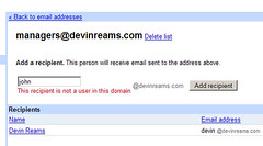
emaillist

You can also create email lists. This is pretty neat because I can create, for instance, a [email protected] that emails the entire management. Very neat but you can’t limit access to mailing to the list (unlike Google Groups).

settingsDomain settings

As far as the sign-in page is concerned you can ‘personalize it’ by changing the sign-in box’s color and a logo (see this page for an example, versus mine). Apparently when I try to change anything I’m greeted by a blank page… so, a work in progress I suppose. Plus, you can dis/allow the use of user emails for Google Talk.

So, in short, it only took me two minutes to set this up. The domain information synched while I ate dinner and I had fully-Google-managed email running in less than 10 minutes. It actually took me longer to write this blog post than set up my account. I’m happy to have spam-free email though, now. If you’d like to take a look and play for yourself, feel free to leave me a comment…

Review: Quicken 2006

I decided to get somewhat ambitious, as you may have noticed, and went through all my finances. I decided it was time to see what the wonderful world of Quicken was like. I must say, it’s a very pretty world.

Using 2006 Deluxe has been a pleasure so far. It’s much more, me-oriented than Microsoft Money. When I started using this software my first reaction was “Microsoft has made some pretty lazy software”. Quicken greeted me with the ability to set goals. I told it I would like to:

  • Setting GoalsManage my checkbook and bills
  • Know where my money is going
  • Save more money
  • Track all of my investments in one place, and
  • Know my net worth

In hindsight I don’t know if I really wanted to know the last one. It’s slightly disappointing. In any case, once the goals are set it walks you through setting up your accounts. The ‘Direct Connect’ feature seems a million times more functional than Money’s. It tells me more than ‘Error’ when and if there’s an issue. Money just sits with a turning wheel while something, unbeknownst to me, goes on in the background.

Once I had my accounts neatly setup and downloaded, I unfortunately had to go through and setup the categorization/memorized payees. Quicken doesn’t download QIF data anymore because it’s, apparently, an outdated standard used for troubleshooting; not downloading transactions. I didn’t mind, though. It allowed me to make sure there was consistency throughout hundreds of transactions.

Some things I really like include:

  • Account BarAccount Bar: it’s always on the screen, tells me my account values and lets me quickly switch between them.
  • Portfolio/Investments: Quicken pulls up a very nice, stat-filled screen for each security I own. The market value/price graph doesn’t crash the program either (as Money did as it tried to download the data) because it uses previously downloaded values.
  • Pin Vault: This feature allows me to save my PINs and then lock them with a single password. Money could save all the PINs automatically but this additional security feature is nice.
  • Budget SetupGUI: Microsoft’s blue is nice, but the subtle shadows make this a very attractive program. The graphs are pretty, the tabs are intuitive. It looks good and that’s important.
  • Reports: I haven’t even had a chance to go through all of these but they’re all very useful and I can’t wait to create some useful analysis.
  • Budget: Quicken’s seems like there’s much more to it. Money would simply ask how often I would spend X dollars in Y category. It would then just apply it as a monthly average value. Quicken allows me to do either that, or by month or quarter. In other words, instead of budgeting $7.45 each month for ‘Christmas Gifts’ I can tell it I only expect to spend $100 in December.
  • Reconcile: I don’t think Money even had this feature. It helped me figure out which transaction I accidently deleted. All I had to do was pull up my online statement for January and I could quickly find the loss.

Obviously I’m enjoying playing around with my new program. I know I wrote about using Money to track your money. After two days I’d recommend Quicken to anyone out there looking for a very nice personal finance program.

[tags]money, finance, personal, software, review[/tags]

Review: edgeio

I’ve had time to play with a new service called edgeio. Essentially, it’s a service that enables bloggers to post listings (job, help wanted, housing, etc.) to their blogs. Edgeio then crawls the blogs and finds the posts tagged ‘listing’ and will aggregate them. The service is free to use but will also provide publishers with additional paid services (to help increase exposure).

At first glance the website is a lot to try and navigate. I found myself not noticing some things that I should have. For instance when creating an account it was not very clear to me how to pick my location. I finally figured out that not only do I have to put in the zip code/city but I then have to click the corresponding city that pops up. I figured by putting in the zip I had done my part. This registration process took three times becuase the error message at the top didn’t stand out. I didn’t realize the captcha changed each time. Haha, I do know how to use the interweb, I swear.

edgeio.JPGThe listings are pretty straight forward. If you click the thumbnail you can see that the listing basically pulls the text (‘I would like to sell…’) from the blog entry and any other information (price, location, tags). I had a few thoughts just looking at the listing though. For instance, when I ‘Subscribe’ what kind of information is going to be sent via RSS? I also thought that the ‘report spam’ button would be useful. But, I suspect (read: hope) edgeio will also have some mechanisms in place. I also like the fact that edgeio incorporates ‘Other Profiles’ like ebay and flickr.

edgeio2.JPGHere is my sample listing which you can see to the right (the page where you manage the listing). Within a few seconds of adding my blog to my profile it had the listing added and a comfirmation email in my inbox. Managing listings are pretty straight forward. But, you can’t change any of the content through the edgeio website. From what I can tell all you’re able to do is change your tags, the listing status, and the price. I wasn’t able to determine whether or not an update to the blog means an update to the listing. I haven’t seen my update yet but they claim that once the blog is added it will routinely check up on it (every 24 hours). Luckily I can go to ‘My Edgeio’ and hit ‘Check for new posts’ under the appropriate blog. Interestingly enough my post was updated but I don’t see it on the page (it has the updates on the ‘Manage’ page, though). Update: It just took a little while…

Anyway, I feel this will have some interesting implications on how individual business is done online. No longer do we have to pay a buck to put something on ebay. This seems like craigslist meets web2.0 meets blogs. I’m interested to see what the paid services consist of. I guess my final thought is: will the blogosphere catch on? Personally, I think if I had anything of substance (services, jobs, stuff for sale) to add I would certainly use edgeio. It’d be silly not to.
[tags]tech, web2.0, edgeio, blogging, commerce, listing[/tags]