This is a great series of maps (explaining the Middle East and really showing what Vox is all about. I learned quite a bit from it. It may sound silly but it also helped me realize how interrelated the various timelines, histories and events covered in high school really affected the world we have today. Learning “European history” seemed so distant from modern day events but these maps and explanations helped some things “click” back together for me.
Category Archives: Internet
Managing Up, Down, and Sideways by Breandán Knowlton
2 Replies
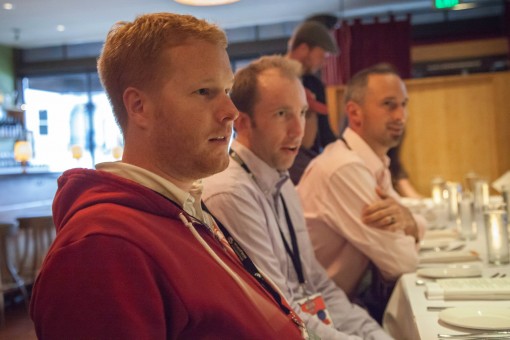
 At the Digital PM Summit this year, I had the pleasure of sitting in a “conversation” session with a bunch of smart folks talking about “Managing Quality In Development Teams”. I could also tell one of the contributors in the corner really knew his stuff and had come from an interesting background. Little did I know, I was sitting in his session the next day titled “Managing Up, Down, and Sideways”.
Breandán Knowlton presented a unique combination of concepts that I’ve taken home to the team (and to heart) when approaching conflicts (or really, any dialogs) with our interactive projects and clients.
I’m sure most folks have heard about “managing up”, or put simply, doing the things that will make both you and your boss (or client) happy. Pro-actively providing status updates before they ask for them, finding what their goals are and aligning your own to meet theirs, finding their values and cater your approaches to those. This all makes sense when applied smartly and is something I know I could think about more often when working with clients and stakeholders.
Knowlton’s talk on “Managing Up, Down, and Sideways” put a kind of spin on this and introduced a theory of four relational models used “to generate, interpret, coordinate, contest, plan, remember, evaluate, and think about most aspects of most social interaction in all societies.” If it’s good enough for all societies, its probably good enough (and applicable) to leading successful projects, no matter the size or shape.
I’ll summarize the four elementary models:
- Communal Sharing: you operate with common respect or values, love for the project or process, take collective responsibility towards success, etc.
- Authority Ranking: respect is geared more towards hierarchy and class structure, prestige or superiority exist here.
- Equality Matching: there is an unbalance perhaps in skills or knowledge and work to share, process exists to keep balance of opinions or efforts, respect may be more towards rules and regulations.
- Market Pricing: standards around cost-benefit come into play, efficiency and effectiveness may be measured, those measurements or ratios are viewed with social meaning.
Thinking about these models and how they can apply to project management should become clear. From here, Knowlton had us all run through an exercise:
- Think about a situation (a project) and then a conflict. From your own perception, what was your priority, what were you thinking about, talking about, experiencing, etc. (and did one of these social models apply to your thinking)?
- From others’ perspectives, what were their priorities and perspectives, (and what model may have applied to them)?
- Once you came to a resolution (it may or may not have been positive), what was the result, did you end up appealing to the same model, or did you find yourself (in hindsight) and your stakeholder(s) applying different models to the situation?
I thought about a project where we were building a complex network of applications and websites that all had to interoperate for a very large internet company. The project was to span nearly a year, had many requirements, plenty of details to review and keep track of, and we were nearing a point of getting final user acceptance and testing completed.
-
From my perspective, at this time (maybe 10 months in), a new stakeholder with new priorities was introduced into the project (as a newly hired senior executive). Some newly stated project priorities from that stakeholder meant the work to date would need to be re-evaluated and substantial new efforts (costs, time) would be required.
-
From their perspective, as an executive responsible for budgets, priorities, etc. this was a big project that didn’t meet obvious unstated goals, it had become more complex than needed to solve some immediate-term goals, and was at risk of not being a meaningful contribution to the organization.
Looking back, a lot of the work and interactions to-date appealed to the Communal Sharing model (we created this project together) but the introduction of a new stakeholder certainly appealed to Authority Ranking. Ultimately, we took the discussion to a common level (Market Pricing) and, in short, discussed the cost-benefit to undoing parts of the project (which also appealed to Authority) and we jointly decided to end the project, hand over our work performed to-date and allow them to continue in their preferred format (Equality Matching).
Thinking about a project’s various stakeholders, their perspectives outside of your way, and then applying the “Relational Models Theory” can likely both describe and allow you to overcome challenges, have more successful exchanges, or simply understand where a situation may have turned.
Virgin America Safety (Music) Video
I love everything about this music video and overall campaign for Virgin America’s safety video. The self-awareness (“for the .001% of you who have never operated a seatbelt before…”), catchiness, and entertainment value is not hard to produce but is a much more enjoyable (required) experience. My guess is other airlines aren’t doing something like this for two reasons: 1) safety is a priority and should not be relegated to a side show, and 2) it’s not the way it’s been done before.
This whole thing makes me step back and wonder why the safety and instructional videos are shown (or demonstrated) in-flight and not something all fliers should pre-qualify for1 (like a drivers license test) before getting on a plane.
- I believe Bruce Schneier or someone similar proposed this when discussing security, TSA, flying, etc. ↩
Reviewing the “Design Process” for Project Managers
 Project Managers, if you’ve been working in the web and “interactive” design space for a while, you may not realize how much you know about the design process.
The thing is, we’ve likely absorbed and learned these things over the months or years. Our clients have not had the benefit of the experience. Here are some things we know, presented by Jared Ponchot at the inaugural Digital PM Summit, and could likely be better educating our clients around:
- Design is not just “look and feel”, design is the process of imposing meaningful order to content and interactions.
- Realize the design process is not unique to our industry and is, for good reasons, similar across industries. Look for metaphor in how cars are made, houses are built, and so on.
- When designing, we should start to aim for “living” deliverables. It allows for tacit, ongoing approval and discussion of priorities. The ‘big reveal’ (Mad Men style) doesn’t always make sense and allow for dialog around design.
Put simply, design is the intersection of purpose, content, and style.
Purpose (why?)
Design is the process intended to figure out how we should best solve the stated problems (need more customers, want to inform the public, etc.). Fleshing out those problems, the purpose, is key to a meaningful design process.
Keep asking why and get to the root issues. Ask more “what will that get you”?
If you tell me you want to build a bridge, I will ask why? You say you want to get across the river. Why? You need to get to work on the other side. Why? Because the fields are on the other side. Why do you work the fields? Over time, instead of building a bridge we may set out to solve different problems than originally proposed.
The who, when, and overall context can affect responses to probing design questions.
Speaking with a team may yield different answers than working individually or separating the bosses from the employees. Sitting and looking at inspirational websites together may allow for more conductive exploration than on a phone call.
Ultimately define purpose statements that serve as the goals to tie decisions back to.
If you don’t know which direction you’re headed (“more customers”), how can you know if you’re actively working towards those goals?
When working with clients, being able to point each evaluation, decision, question back to the goals is the best way to ensure the design process has a good chance of resulting in success.
Content (priority not position)
Two excellent tools exist to start pulling together the content that will solve your stated problems.
Content Model
There are three things we can capture to effectively design solutions.
- Content types: in order to meet the stated goals, what content are we creating, publishing, and making available?
- Attributes: for each of those content types, what are the attributes that define them? (title, image, etc.)
- Relationships: where and why is the content related? (blog posts about each product)
As you define these, you can begin creating artifacts that moves the design process along in a meaningful way.
Display Model
Describing how the content is presented can be achieved with wireframes, sketches, etc. and is typically what we think of when we think “design” (but as you see, it shouldn’t be the first step in the process):
Sketches and descriptions of the various templates start to demonstrate the priority (not just the position) of content (which was defined because it achieved stated goals). Describing the various components and the hierarchy results in a vocabulary and series of artifacts to inform the final designs.
Style (is not powerless)
This final piece is what may be considered, by most, all there is to the “design” process. Style is not simply preference. A couple points to help explain why style is not the first step and is not a powerless piece (nor the entire point), of the design process:
Color enhances priority, it’s not just a preference. When we propose a dark red button on the sparse, white screen, that color contrasts and demonstrates hierarchy (it is more important). If a client asks for it to be gray, that may not solve the stated problem (“convert more user to subscribers”) and is not just because gray is a “better” color.
Style allows for personality and can make a design more human and connect to a visitor, user, potential client. It helps express a brand and separate a business from others in the space. Picking a “flat” style versus a “textured” style should not simply be a preference.
Aim to seek evaluation against the stated goals and frame the display and style discussions (reviewing mockups, layout concepts) around the purpose and content defined earlier.

My Biggest Take-Aways from WordCamp San Francisco 2013
My biggest take-aways from WordCamp San Francisco 2013 were:
- 2 water bottles
- 4 t-shirts
- 10 stickers
- 2 pair of sunglasses
…but seriously, the sessions I attended were great and I was able to see the direction that the WordPress project and community are headed. All while having some serious (and fun) discussions (with beverages).
Devin, Alex, Shane at dinner with WP Engine. Photo credit Raquel Landefeld
Here are some of my highlights from a ‘project’ perspective (and perhaps less technical):
git is coming
The tool makes development easier for a number of developers and, if we’re already doing other work with git, why not WordPress development? Sure, Otto says there’s nothing that can’t be done in subversion, but I think this will also help lower a barrier to entry for new developers and contributors.
the project continues to grow up
The lego diagram that Matt showed during his keynote closely matches a metaphor I’ve been working on with the Crowd Favorite team on our WordPress page on our in-progress website redesign. Thinking about WordPress as a platform — which on top of that is a CMS, which on top of that is a blog — is an interesting way to think about the project’s direction and I hope it starts to drive more of the core design and development decisions (and not simply blog-centric decisions that would have us chasing after competitors like Medium and Squarespace).
More technically speaking, there were also some good conversations started around re-organizing the project code and even Open Sourcing more of the project website (http://wordpress.org/) and the tools themselves. It’ll be fun to keep these efforts moving, mature the operations, and make it easier for others to join and contribute to the project.
we should stop accepting bad practices
I think this point dovetails nicely from the previous two: do the right things, do the best things, and don’t get dragged down by the least common denominator. I think we’ll see this affect decision making for years to come and look back at 2013 as when a lot of this began.
Mark Jaquith’s talk also showed a lot of people the tip of the iceberg when it comes to solving known problems: botched deploys, late-night deploys, losing code changes, having proper testing environments, and so on.
project management is hard
The greatest engineers are not necessarily the greatest project managers. A lot of people have acted in various capacities as ‘leads’ and ‘representatives’ and so on but I think we’ll start to see more prioritization, active scheduling, management, accountability, process, and so on. There are pros and cons to having everyone and anyone “contribute” and there is room for improvement. It’ll be an experiment as we go into development of versions 3.7 and 3.8 to see how changes in process and management affect the overall project momentum, quality, and so on.
But most of all, it’s fun to come together and chat with friends (new and old) and talk about how things are going, where things are headed, where we’ve all been, and trade notes on personal and professional subjects alike. Here’s to another great WordCamp San Francisco.
The Monktoberfest, my favorite conference at the confluence of technology and beer, is back for 2013 in lovely Portlane, Maine. Tickets just went on sale and there’s only a few dozen left. Prior speakers and companies in attendance include ZenDesk, GitHub, Untappd, Mozilla, Facebook, and more.
Here’s some photos from the inaugural Monktoberfest in 2011.
A local research firm reached out to ask some questions about how I monetize my “other blog”, Colorado Snow (cosnow.com). It turned into what I think is a good Q&A session around what has become, essentially, a part-time hobby.
Read on if you’re interested in why I started (and continue to run) Colorado Snow (hint: it’s not the money).
From over a year ago, an article by WIRED I had a started to draft a blog post about, is now extremely relevant:
For the first time, a former NSA official has gone on the record to describe the program, codenamed Stellar Wind, in detail. William Binney was a senior NSA crypto-mathematician largely responsible for automating the agency’s worldwide eavesdropping network. A tall man with strands of black hair across the front of his scalp and dark, determined eyes behind thick-rimmed glasses, the 68-year-old spent nearly four decades breaking codes and finding new ways to channel billions of private phone calls and email messages from around the world into the NSA’s bulging databases. As chief and one of the two cofounders of the agency’s Signals Intelligence Automation Research Center, Binney and his team designed much of the infrastructure that’s still likely used to intercept international and foreign communications.
My guess: Google, Apple, etc. are not knowingly handing data over, just “named” as sources the NSA is obviously interested in harvesting. As the Wired article describes, the NSA is intercepting data (at the lowest levels possible) and currently or planning to decrypt, decypher, and extract as much as they can…
I found some confusion an interesting discussion over on WordPress Tavern around Post Formats:
I used post formats for a few months on WPTavern.com and I’ve made a few conclusions. The first is that post formats encourage short form content. Not only is short form content easy to do, it also promotes creating a fire hose of content. The second, the majority of people were reading WPTavern.com via their favorite feedreader. Feedreaders don’t display content the same as a website. Third, some of the formats I selected displayed on the home page without a post title or an ability to comment. I think this had more to do with how my theme was displaying the formats more than anything else. Last but not least, I started treating post formats as categories.
Here are my thoughts and response republished:
As Chip has described, the concept of a “format” really just started as supported taxonomy to allow theme developers to apply consistent treatment across any blog (instead of one theme using post meta, one using a category, etc.).
Jump forward to (the in-progress) version 3.6 of WordPress and everyone has come to the same conclusion and realized there is more nuance and potential. What if this is a video post and my theme wants the video on top of the content and her theme wants it below? Standardized meta1 on that allows for more interesting things and the ability to solve more interesting problems.
To Rob’s point, the initial implementation was confusing, but we (Crowd Favorite) created the FavePersonal theme and the Post Formats UI plugin because if we standardized on meta and fields, we could do fun stuff in the loop views, single views, and feed very easily (eg: put a full width image on the single view of “Image” posts and drop the sidebar, replace the permalink in the feed with the “Link URL” a la Daring Fireball or other linkblogs, etc.).
Hopefully this leads to more interesting uses of WordPress in the near future…
- I don’t think the PressThis bookmarklet has done us a good long-term service here because now some display is coupled to the_content and for others the theme itself. ↩
We planted some flowers, tidied up the gardens, and put some veggies in the (raised) ground. If you’re not following the devinandrachel.com blog you’re missing out on some cute stuff.