Tag Archives: mobile

Simple tweaks to your iPhone-friendly website

If you own and operate a website, odds are you have mobile users browsing it. Be sure you take care of these people as their numbers are ever-growing.

Get me out of here!

Hopefully you already have a mobile-friendly version of your site (for WordPress users, I recommend the Carrington Mobile theme). Bonus points if you have a mobile-friendly version but users can exit out of that version. Though the simpler, faster interfaces are often appreciated, users get frustrated if they’re trapped in a ‘dumbed down’ version of the site (especially if they have a ‘smart’ browser like MobileSafari on the iPhone).

ESPN Mobile vs Standard

click to enlarge

For example, on my iPhone, I open http://espn.com which smartly detects my browser’s user-agent and serves me a nice, big iPhone-friendly version of their website. But, while out to lunch, I may want to show a client the layout, design, and colors of the espn.com website. No problem, I can scroll to the footer of the mobile page and click the ‘ESPN.com’ link. Suddenly I’m out of the mobile site and presented with the “real” espn.com for demonstration purposes. Sadly, many sites don’t allow this. Don’t let your visitors become trapped in user-agent hell.

Give me an Web Clip icon, not a thumbnail

Hopefully your site already has a favicon, that nice square icon that usually appears in your browsers address bar next to the URL, or in the tab next to the page title. Favicons are an important detail that everyone appreciates. With ten tabs open, a user can quickly locate Gmail and switch to it immediately.

So why do most web developers overlook the iPhone’s Web Clip icon? It’s a simple 57×57 PNG file used when a visitor bookmarks your website and adds it to their homescreen. Your website can looks a million times more professional if you define your icon. I can’t think of a single site that looks good as a 57-pixel thumbnail screenshot. Compare the icons for the Colorado Department of Transportation’s mobile site and Colorado Snow (my website) to that of Colorado Ski Country USA and GO I-70:

Web Application icons vs. thumbnails

Web Application icons vs. thumbnails

The Apple iPhone SDK (Web Applications) can’t make it any more simpler for you, either:

To specify an icon for the entire website (every page on the website), place an icon file in PNG format in the root document folder called apple-touch-icon.png or apple-touch-icon-precomposed.png. If you use apple-touch-icon-precomposed.png as the filename, Safari on iPhone OS won’t add any effects to the icon.

Kudos for having the mobile site, but please, create the icon.

Save some space, go fullscreen

One of the less-used features available to iPhone Web Application’s is the “fullscreen” mode where the viewport is the only item on the screen. The URL text field and button bar are completely removed. Compare CoTrip to Colorado Snow:

Compare fullscreen vs. standard

Compare fullscreen vs. standard

Much less space is wasted on browser “chrome” and more is dedicated to the viewport meaning less scrolling and more immediate information can be consumed by the visitor. And again, the implementation is very simple:

Set the apple-mobile-web-app-capable meta tag to yes to turn on this feature.

In conclusion…

There are a number of subtle tweaks that can help optimize your website for mobile users. Again, the number of smart phones and web-enabled devices are only going to increase. Getting in the habit of implementing some of these considerations will only help your reputation. And remember, these are just three suggestions I quickly came up with for the iPhone. Think of the variations: Palm, Android, Blackberry, and so on…

Most underrated iPhone applications

I love the iPhone (on T-Mobile). It’s been an awesome phone slash iPod slash internet device for me for almost two years now. As I check out some of the other mobile phones out there I realize I may never leave the iPhone because of its applications.

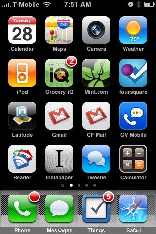
It’s always fascinating to me to see what other people’s home screen looks like (what applications do you use the most? why is that one up there? why do you have two red icons next to each other? etc.) and I’ve found some of my favorite applications just by seeing what other people use.

iPhone home screen

In fact, word of mouth, like many other products, is the best way to find the best applications. Talking to a trusted source with similar interests and behaviors is a great way to find applications that match your lifestyle. Matt Galligan introduced me to Grocery IQ and it’s served as my grocery list ever since.

So, with that said, here are my favorite underrated apps for the iPhone:

Instapaper Pro ($5)

Instapaper is one of the greatest free services on the web. Marco has spent a lot of time building a site where you can flag web pages you want to read later (built in to Tweetie, bookmarklet available, etc.). Instapaper takes the page, saves it, and adds it to your very simple list of unread articles.

The iPhone application is perfect because it syncs with your Instapaper account, downloads the text-only (optional) version of the page, and allows you to read it on your phone. The fonts are customizable, the orientation can be swapped (portrait/landscape) and it even uses the accelerometer for tilt scrolling (look ma, no finger swiping). Even though I don’t need all of the ‘Pro’ functionality, I bought this app just to support an excellent product. Instapaper Pro (download) has changed the way I poop.

Mint (free)

If you use the web-based money management service Mint, then the iPhone app is the natural compliment to the site. The application shows your account balances, recent transactions, and budgets. Everything you need in your pocket to decide “should I really buy a burrito for lunch?” or “should I really be buying a round of shots tonight?”

You may not focus on finances that often but by having the application, you can check your money’s pulse in a few taps and start to understand important things like: where is my money going? Am I on track this month? Mint (download) has helped me cut costs and optimize my spending.

foursquare (free)

Hands down, foursquare is one of the best location based applications available. You simply ‘check-in’ to the various places you visit (socially) and start to gain points and badges based on where you’re at. But that’s not the point, you can see where your friends are this weekend, where they’ve been (“hey, what’s the scene like there? is it worth stopping by?”) and discover some cool places through to-dos and tips left by other players.

The iPhone app has push notifications so you can be alerted when your friends are out and about. Mayorship status (most check-ins at a location in the last 60 days) sometimes gets you a free drink. Foursquare (download) is an amazingly fun, social location game that makes me want to live a more interesting life.

But those are just a few…

What are your favorites? I’m sure there are tons out there that I’ve never even heard of. Leave a comment or start your own post and leave a pingback.

Note: GV Mobile had originally been on this list but has since been pulled from the app store.