Content Before Design: a shift in how to manage web projects

I like to joke that Happy Cog and the people that work for (and with) them sometimes act as the research and development arm of the digital / interactive project management industry.

digital-pm-summit-2013A novel idea, writing content before design, discussed by Steph Hay at the inaugural Digital PM Summit is crazy (good) enough it could completely transform digital design projects for the better. As with any good R&D process, we may be in the early days of a complete shift in thinking (like mobile-first design has been in the past few years). Or, we may forget this entirely due to lack of buy-in and ability to ‘grok’ an alternative approach.

That said, I recommend all digital project managers and organizations looking to do an online project in the near future and consider this approach and continue testing this approach and the resulting effects.

Approach

Beginning a project by talking about the audience(s) and precise interaction(s)s that currently do or need to happen means getting past guessing about what content elements and design templates need to be “designed” while still embracing ambiguity and figuring this out as you (or your client) go through the process.

Clients often want to see a layout or a concept, or a list of content types before “plugging in” all the final copy text, words, and so on. Once we “see it” we’ll make the content work to match the discovered goals of the design, right?

Writing content first means zooming in on a single piece of content, say a product description page, and writing precisely what needs to be on that page. Then stepping up a level, and repeating the process, and then moving sideways across all unique items in the project to see what patterns, unique elements, and hierarchy emerge.

This process allows the designer to then create a model that best fits the content presented and makes their job easier (and more successful). It could mean a designer will realize a call-out box design element is the best method to prioritize a testimonial on the page versus designing a page concept with testimonials included when the client has no real customers (or testimonials) yet. It could means noting the whimsy in the ‘voice’ on the page should be matched by the stylistic elements surrounding the page.

Read more about the specifics of the process at stephaniehay.com »

Results

Steph walked through a recent successful website re-design project she led that followed a content-first approach and I’m convinced. Both you and your clients should realize the benefits to taking this approach and see if its worth going down this content creation path up-front:

  • Increases organizational capacity: if your client goes through the exercise of writing content up-front and making all the hard decisions, this then allows them to work in parallel while you begin the design process.
  • Prompts for stakeholder involvement earlier: often when a design concept is presented with ‘lorem ipsum’ placeholder text, “higher ups” do not want to be involved until things are closer to completion so they can provide meaningful feedback. Having content in place flips the switch sooner to allow looking at closer-to-final artifacts.
  • Gets to decisions quicker: when needing to provide feedback, a mental disconnect can happens if you’re able to skim over the placeholder text and simple assume the “right” content will fit naturally. As you write content, as you define the content and display models, the two convene sooner and allows for more acceptance, revisions, and testing along the way.

A traditional design process without content written first means you can’t discover what’s needed until you realize its missing.When a discovery like this happens so far into the implementation process it can de-rail a project with rework, missed timelines, blown budgets, and disappointed stakeholders.


Steph has a framework on how to begin a project with content discussions first that I encourage project managers to review and consider.

I’d also recommend comparing and contrasting this thinking to the traditional design approach found in typical interactive projects and considering the pros and cons of each.

Reviewing the “Design Process” for Project Managers

digital-pm-summit-2013Project Managers, if you’ve been working in the web and “interactive” design space for a while, you may not realize how much you know about the design process.

The thing is, we’ve likely absorbed and learned these things over the months or years. Our clients have not had the benefit of the experience. Here are some things we know, presented by Jared Ponchot at the inaugural Digital PM Summit, and could likely be better educating our clients around:

  • Design is not just “look and feel”, design is the process of imposing meaningful order to content and interactions.
  • Realize the design process is not unique to our industry and is, for good reasons, similar across industries. Look for metaphor in how cars are made, houses are built, and so on.
  • When designing, we should start to aim for “living” deliverables. It allows for tacit, ongoing approval and discussion of priorities. The ‘big reveal’ (Mad Men style) doesn’t always make sense and allow for dialog around design.

Put simply, design is the intersection of purpose, content, and style.

Purpose (why?)

Design is the process intended to figure out how we should best solve the stated problems (need more customers, want to inform the public, etc.). Fleshing out those problems, the purpose, is key to a meaningful design process.

Keep asking why and get to the root issues. Ask more “what will that get you”?

If you tell me you want to build a bridge, I will ask why? You say you want to get across the river. Why? You need to get to work on the other side. Why? Because the fields are on the other side. Why do you work the fields? Over time, instead of building a bridge we may set out to solve different problems than originally proposed.

The who, when, and overall context can affect responses to probing design questions.

Speaking with a team may yield different answers than working individually or separating the bosses from the employees. Sitting and looking at inspirational websites together may allow for more conductive exploration than on a phone call.

Ultimately define purpose statements that serve as the goals to tie decisions back to.

If you don’t know which direction you’re headed (“more customers”), how can you know if you’re actively working towards those goals?

When working with clients, being able to point each evaluation, decision, question back to the goals is the best way to ensure the design process has a good chance of resulting in success.

Content (priority not position)

Two excellent tools exist to start pulling together the content that will solve your stated problems.

Content Model

There are three things we can capture to effectively design solutions.

  • Content types: in order to meet the stated goals, what content are we creating, publishing, and making available?
  • Attributes: for each of those content types, what are the attributes that define them? (title, image, etc.)
  • Relationships: where and why is the content related? (blog posts about each product)

As you define these, you can begin creating artifacts that moves the design process along in a meaningful way.

Display Model

Describing how the content is presented can be achieved with wireframes, sketches, etc. and is typically what we think of when we think “design” (but as you see, it shouldn’t be the first step in the process):

Sketches and descriptions of the various templates start to demonstrate the priority (not just the position) of content (which was defined because it achieved stated goals). Describing the various components and the hierarchy results in a vocabulary and series of artifacts to inform the final designs.

Style (is not powerless)

This final piece is what may be considered, by most, all there is to the “design” process. Style is not simply preference. A couple points to help explain why style is not the first step and is not a powerless piece (nor the entire point), of the design process:

Color enhances priority, it’s not just a preference. When we propose a dark red button on the sparse, white screen, that color contrasts and demonstrates hierarchy (it is more important). If a client asks for it to be gray, that may not solve the stated problem (“convert more user to subscribers”) and is not just because gray is a “better” color.

Style allows for personality and can make a design more human and connect to a visitor, user, potential client. It helps express a brand and separate a business from others in the space. Picking a “flat” style versus a “textured” style should not simply be a preference.


Aim to seek evaluation against the stated goals and frame the display and style discussions (reviewing mockups, layout concepts) around the purpose and content defined earlier.

Link

Denver friends, you’re cordially invited to a viewing party at the Crowd Favorite offices this Thursday. The excellent Passion Projects talk series presented by GitHub (to surface and celebrate women in technology) will be live-streamed.

Hurry and register now to watch Leslie Bradshaw’s talk. It should be excellent but we have limited space available.

Three things taught incorrectly in business school

Having graduated college nearly six years now its interesting to look back at some of my underlying assumptions and teachings. There are three that I think anyone would agree are consistently applied at schools all over the United States (and perhaps the world) and I find myself disagreeing with them more and more lately.

Business success is achieved through gaining market share

Nearly every class (accounting, finance, marketing, management) assumed that gaining market share was one of the primary goals of doing business. You couldn’t be successful if you only had 1% of the market. Yet, Apple aimed for 1% of the mobile phone market and has ended up somewhere around 10%, claiming nearly all of the profits in the industry (alongside Samsung). They didn’t need a majority and they didn’t even aim high, yet they’ve changed the world and the industry as we know it.

Market share is important in some businesses, but not all. The world is smaller than it was 30 years ago and we have more knowledge, more choice, and products and services are more accessible to more people now. Solving interesting problems, maximizing profits, giving back to the community are also worthy primary goals.

Corporations are created to maximize stockholder value

Nearly every course revolved around public corporations. Which means we learned a lot about stock prices, options, voting rights, legal contracts and so on. I now start to realize, we were also taught a primary goal of a company is to maximize stockholder value. In many cases, stocks are a great way to incentivize management and employees. They’re also a great way to raise money to catapult a company to a new level. But, in most of those cases the idea on the surface is to enrich someone else.

I feel this detracts from one of the main reasons you’re in business: the customer. You create widgets to solve a need for a customer. But we treat that as a means to an end: creating a huge company with tons of stockholders that demand the price to go up. If they start to distract from the creation of good widgets there may be side effects: cheaper quality, externalities such as added pollution, worse customer service, reduced employee retention, and so on.

Sustainability comes last

The final semester of our college careers — after many of us already have a job lined up, after grades fade away — we were mandated to take a course on ethics and sustainability. We were taught how important it is to be ethical and do the right thing (and what does ethics mean?). We learned ways to build sustainable businesses through case studies and explored theory around doing the right thing. Though, it was as if, after three or four years, we were unfairly asked to reapply all the things we just learned (gain market share, maximize stockholder value) with a new filter that largely contradicted those points.

The Patagonia’s and Apple’s of the world were interesting to explore, but it would’ve been more useful to see them upfront and realize how to build sustainable and ethical business practices throughout our college semesters, not as an afterthought near the end.


I think this is important to step back and think about, critically, because these assumptions have been the foundation for many decisions and approaches to my (and many others’, I’m sure) first few years of “work”. I can’t help but think this is why we see a lot of the issues led by greed: predatory lending, the mortgage crisis, bank collapses, aluminum price fixing, labor issues, and so on.

There’s a place for these lessons but I think they’ve overlooked the virtues and values so many of us espouse.

Link

This is the concise series of points I wish one of my drafts had become (after chatting with and listening to folks from Voce Platforms, 10up, WebDevStudios, and many others):

There’s no limit on the number of companies that can be successful, because there isn’t a universal definition of success. Some companies strive for the lowest prices, others to provide the most jobs, some to be the most efficient, and some strive for the highest possible quality. There are endless possible combinations. And that is a great thing to be celebrated.

Well said. The entire thing is a great read.

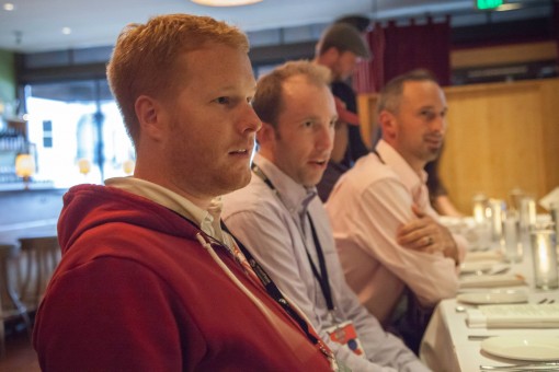
Devin Reams, Alex King, Shane Pearlman at dinner with WP Engine

My Biggest Take-Aways from WordCamp San Francisco 2013

My biggest take-aways from WordCamp San Francisco 2013 were:

  • 2 water bottles
  • 4 t-shirts
  • 10 stickers
  • 2 pair of sunglasses

…but seriously, the sessions I attended were great and I was able to see the direction that the WordPress project and community are headed. All while having some serious (and fun) discussions (with beverages).

Devin Reams, Alex King, Shane Pearlman at dinner with WP Engine

Devin, Alex, Shane at dinner with WP Engine. Photo credit Raquel Landefeld

Here are some of my highlights from a ‘project’ perspective (and perhaps less technical):

git is coming

The tool makes development easier for a number of developers and, if we’re already doing other work with git, why not WordPress development? Sure, Otto says there’s nothing that can’t be done in subversion, but I think this will also help lower a barrier to entry for new developers and contributors.

the project continues to grow up

The lego diagram that Matt showed during his keynote closely matches a metaphor I’ve been working on with the Crowd Favorite team on our WordPress page on our in-progress website redesign. Thinking about WordPress as a platform — which on top of that is a CMS, which on top of that is a blog — is an interesting way to think about the project’s direction and I hope it starts to drive more of the core design and development decisions (and not simply blog-centric decisions that would have us chasing after competitors like Medium and Squarespace).

More technically speaking, there were also some good conversations started around re-organizing the project code and even Open Sourcing more of the project website (http://wordpress.org/) and the tools themselves. It’ll be fun to keep these efforts moving, mature the operations, and make it easier for others to join and contribute to the project.

we should stop accepting bad practices

I think this point dovetails nicely from the previous two: do the right things, do the best things, and don’t get dragged down by the least common denominator. I think we’ll see this affect decision making for years to come and look back at 2013 as when a lot of this began.

Mark Jaquith’s talk also showed a lot of people the tip of the iceberg when it comes to solving known problems: botched deploys, late-night deploys, losing code changes, having proper testing environments, and so on.

project management is hard

The greatest engineers are not necessarily the greatest project managers. A lot of people have acted in various capacities as ‘leads’ and ‘representatives’ and so on but I think we’ll start to see more prioritization, active scheduling, management, accountability, process, and so on. There are pros and cons to having everyone and anyone “contribute” and there is room for improvement. It’ll be an experiment as we go into development of versions 3.7 and 3.8 to see how changes in process and management affect the overall project momentum, quality, and so on.


But most of all, it’s fun to come together and chat with friends (new and old) and talk about how things are going, where things are headed, where we’ve all been, and trade notes on personal and professional subjects alike. Here’s to another great WordCamp San Francisco.

Time flies. It’s already been two years since Rachel and I tied the knot at the Denver Botanic Gardens. In the past year, we’ve had a lot of fun adventures together: visiting New Orleans for the first time, camping a few times (and forgetting most of the supplies once), hiked Hanging Lake, watched the new Arrested Development episodes (loose seal!), painted fat penguins with friends, planted a vegetable garden, skied at Steamboat for the first time, nordic skied for the first (and last?) time, cheered on the CU Buffs in person for the first time in years, started golf lessons, played in a bowling league (really?), helped friends move, had an appendix removed, enjoyed opening night of The Book of Mormon, visited the Dominican Republic and Lake Powell with respective families, installed flagstone (and removed sod by hand, sorry). It’s been a great year!

Here’s to many more, Rachel…

Link

I was one of the earliest to register for B-Cycle (Denver’s bike sharing system) and now I’m excited to sign up for car2go in Denver.

Different from some existing car sharing services (which I’ve also tried), car2go has worked out a local ‘zone’ where if you park on the street (even in metered areas), you can leave the car there instead of being tied to specific parking lots of spots in the city. So, I can literally park in front of my house after taking a trip and use the app to find the nearest car (which may be in my neighborhood or on the same street where I work). It’s a great service and made me think of this quote:

A developed country is not a place where the poor have cars. It’s where the rich use public transportation — Enrique Penalosa, Mayor of Bogota

For a limited time, the $35 registration fee is waived if you use offer code “ROCKIES”. Check out car2go in Denver.